Envato Milkshake: React front-end development
2019

Brief
Build the prototype side swipe interaction system and the initial batch of front-end templates for a mobile first site builder application.
Context
I had the opportunity to work with Envato on their Milkshake application when it was in prototype stages to prepare some of the initial look templates as well as build the horizontal and vertical slider system.
The challenge here was that this was a new product that needed to work primarily for mobile but would also fallback gracefully to desktop and still allow for horizontal swiping for navigation between pages and vertical scrolling on each page.
Solution
To allow for both horizontal page scrolling (navigation between pages) and vertical scrolling (reading pages), I built a custom JS component that leveraged SwiperJS. The initial templates were built with TypeScript and tested using Storybook.
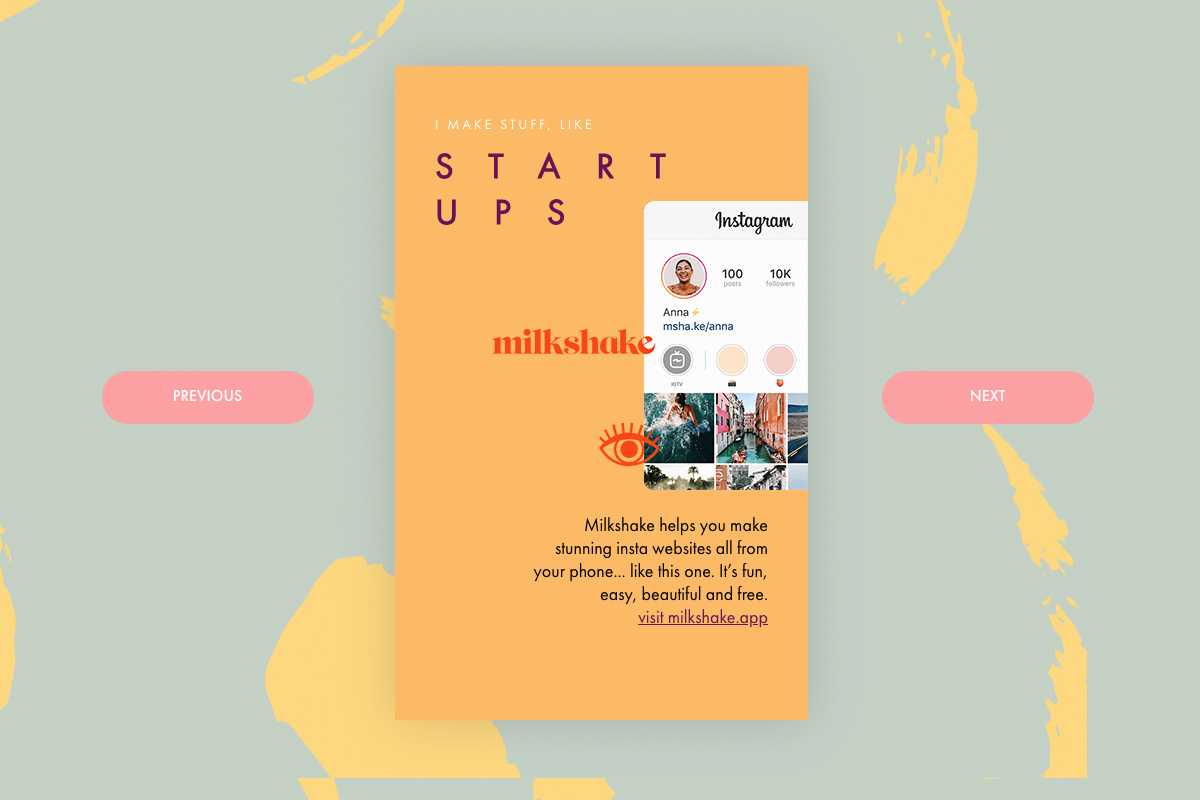
Below, you can see how some of these templates looked on desktop:

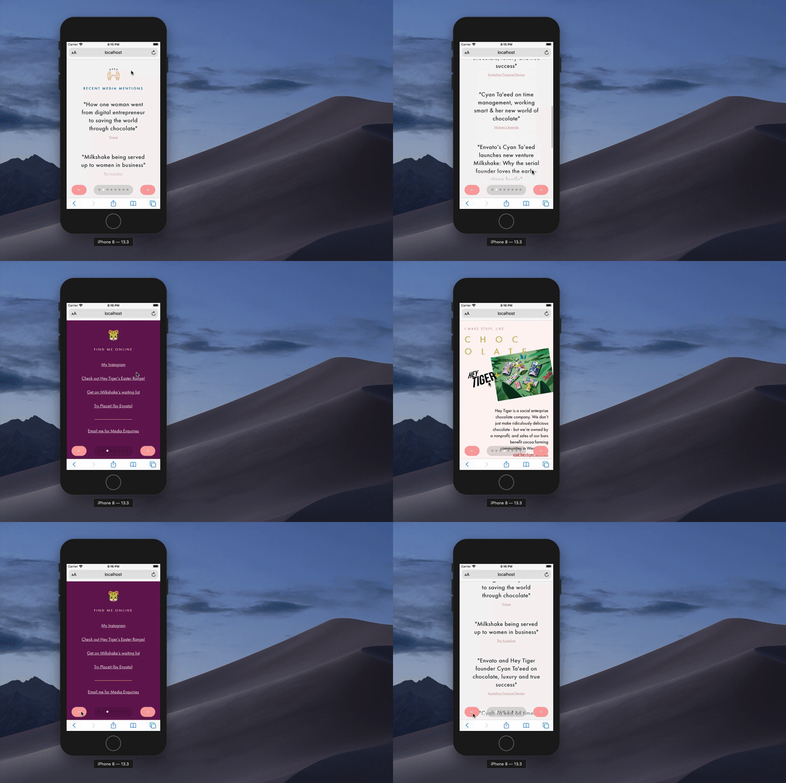
On mobile, the templates would also include a navigation component that popped up at the bottom of the screen. Below you can see an example on mobile with the vertical and horizontal swiping in action:

All in all, you would think this would be a simple front-end exercise, but because all of the components on screen could be configured and customized with content by the user, we had to extensively test each section of every template, and this is where Storybook came in really handy - if you haven't tried it, I'd suggest checking it out.
I enjoyed the project because it gave me a chance to work with the awesome team at Envato and also to contribute as well as learn. Milkshake launched and now has hundreds of templates and components that users can configure to create their own custom mobile sites.