Introvert Films: Front-end development
2020

Brief
Build a simple to use website that focuses on showcasing projects and work for a contemporary arthouse cinema company based in Berlin. Don't use any modern frameworks or CMS.
Context
Introvert Films is founded and run by my friend and ex-colleague, Greg Blakey. Greg and I worked together back in the mid 2000s for Elite Sports Properties - an athlete and events management company that had it's own design and digital studio.
We built websites, digital displays for live-sites, Flash games and a whole bunch of other random things while we were there. He was the designer, I was the engineer.
After we both finished up at ESP we continued to collaborate on the odd project, but for the most part, Greg moved into motion graphics and film - which eventually lead him to picking up his life and moving over to Berlin to work.
We caught up and he mentioned that he was looking to build a new site for his company which he had already designed. Greg was struggling to find someone to work with who could build it without using some unnecessary framework, CMS or other bloated components and I sympathized with the problem as it was something we encountered back at my old studio as well, clients would complain that they were sold a system that just didn't fit with their needs.
Usually this is because developers try to use what they know, or try to use the latest shiny toy, without giving too much thought into what the client actually needs.
We discussed how much web had changed since when we first started and in some ways how it hadn't (hello, in-line styles!).
After seeing the designs, I mentioned that I could probably build the site he was after in a few days. Even though I've been out of the web-dev game for some time now and am wearing a PM hat these days, I knew that what Greg wanted for the site was something that he could still get into and tweak and edit himself later. He also didn't want a database or CMS as he was quite comfortable uploading case studies himself.
I told him we'll go old-school, back to basics, just pure HTML and CSS, so that the site is simple and he can edit and understand how it's all built should he need to update it later or continue to add more content himself.
(I even decided not to use any additional tools like gulp or SCSS and just went with the usual CSS)
Solution
First off, I put my web-dev hat on and started looking at the designs to see how I might build out each part and to assess which areas would be re-useable.
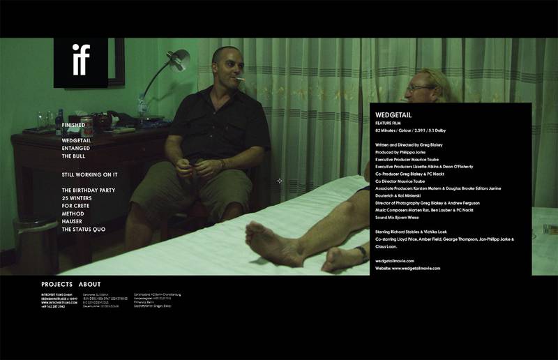
How would a layout like the one below, for example, appear on different screens? Which parts would stay static in place and which would move? How do I tackle the 'projects' navigation?
I got to work building the desktop header, menu and footer areas and then built out the projects template and added some content.
I used Tiny Slider 2 for the carousel on the project pages - I considered building something super basic myself, but honestly, this library is small and did the job well enough.
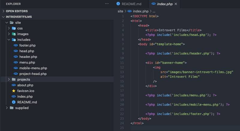
For the structure, everything was split up into some basic PHP includes so that areas like the header, footer and nav could just be updated in single spots and all the HTML files wouldn't have to be updated if a menu item changed.
The result was a code-base that was really simple to understand for someone who is only used to HTML and pure CSS.
Of course, I could've probably gone further with this and use some basic router etc, or even used composer to pull in some other fancy stuff, but that was not the point - the point was to keep it simple and allow a user with just the basics to get in and make changes without having to run commands in their terminal.
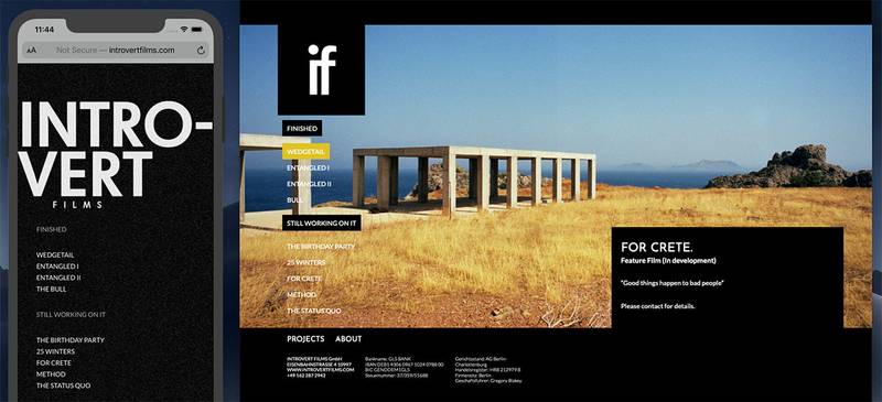
To make the site responsive I used basic break-points to target the various screen sizes the site design catered to. The design was a little different for the mobile version, as you can see below:
It was really refreshing to not only jump back into a bit of web development, but to do it in such an old-school way where I really only used pure HTML, CSS and 1 JS component - no jQuery, thank you very much.
Of course, we could've gone to town on this and build it with a whole stack of npm packages or maybe using some PHP for routing and templating - but that would be building it for me to use and continue to work with and not for the client.
You can check out the finished product and see some of Gregs awesome work at introvertfilms.com.


